This article outlines the steps to use the custom data analysis tool.
Overview
The data analysis tool on the AI & Analytics Engine enables you to gain insights into your dataset's characteristics. It provides statistical summaries and visualizations for your dataset. These insights allow you to prepare data and engineer features appropriately, which in turn enhances the accuracy and efficiency of your machine-learning workflows.
You can access all analysis results of a dataset in its details page, under the “Analysis” section. Each analysis result contains two views: “Single column” and “Pairs”
Single column
In this view, you can choose one column at a time to see its a visualization of its value distribution and summary stats.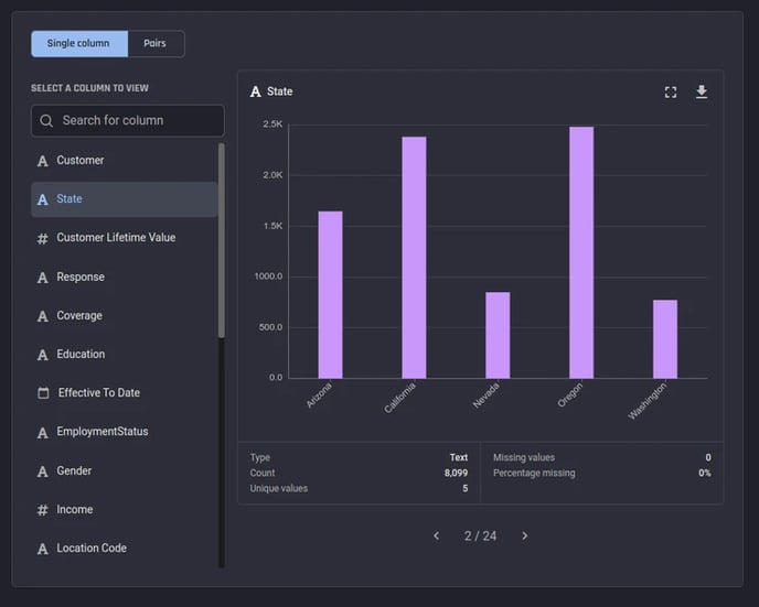 Single-column view
Visualizations are only available for columns containing categorical or numeric data. For both categorical and numerical data, the count of non-empty values, the number of unique values, the count and percentage of missing values are shown as part of the statistical summary.
Categorical data
For categorical data, a categorical bar plot of value counts is provided, showing the number of instances in the dataset for every unique value found in the column.
%20with%20statistical%20summary.webp?width=644&height=580&name=Categorical%20bar%20plot%20(value%20counts)%20with%20statistical%20summary.webp) Categorical bar plot (value counts) with statistical summary
Categorical bar plot (value counts) with statistical summary
Numeric data
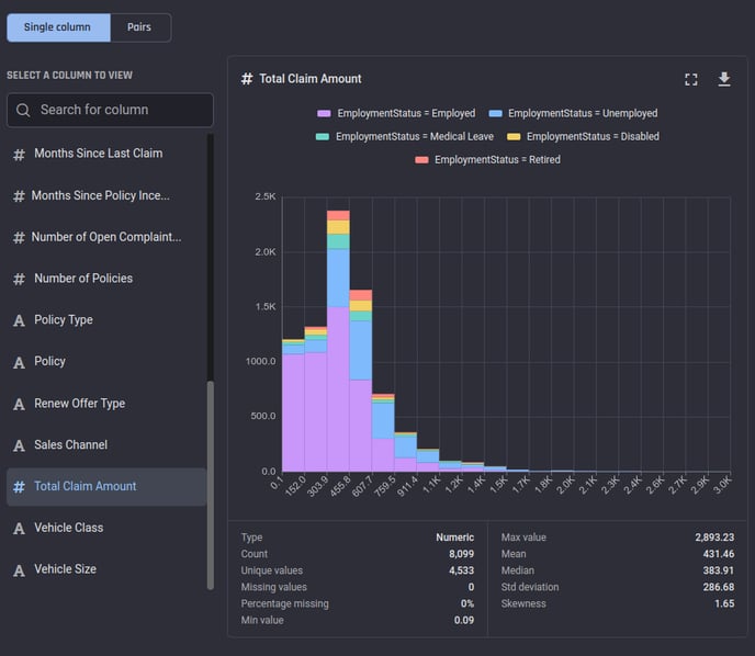
For columns with numeric data, a histogram plot is generated. The histogram plot divides the available value range in the column into a fixed number of bins and shows the number of instances in the dataset in each bin.
Additional information provided in the statistical summary include the minimum and maximum values, the mean (average value), the median, the standard deviation and a measure of the skewness of the distribution.'
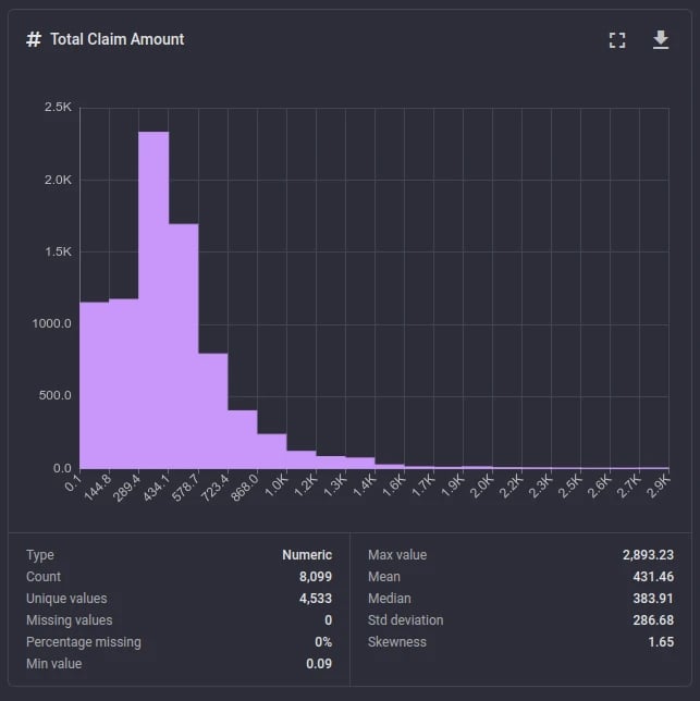 Analysis results of a numeric column: Histogram with statistical summary
Pairs
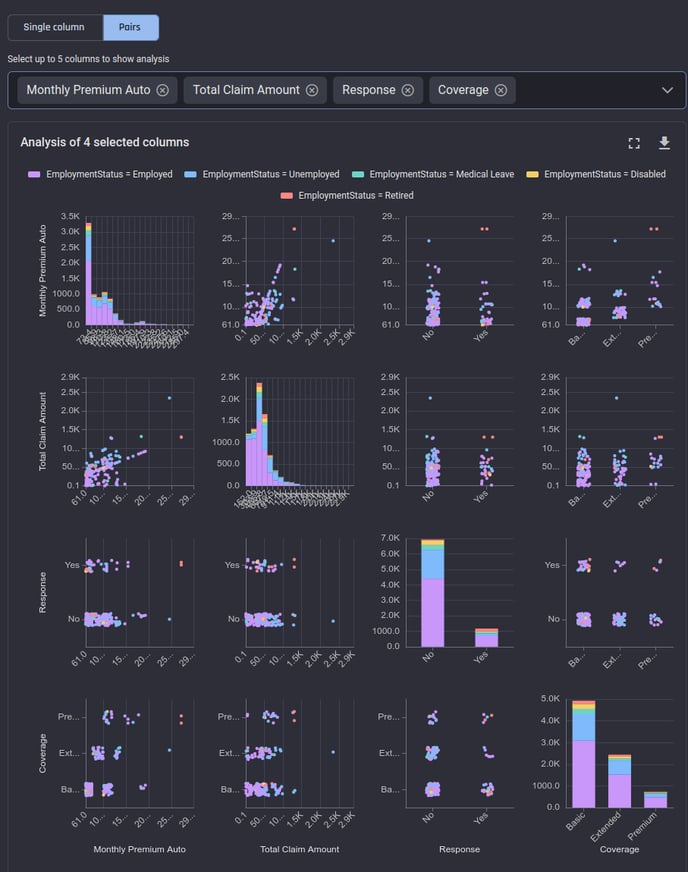
In this view, you can choose up to 5 columns at a time to get a pair plot visualization, to get a matrix of plots where:
-
Each plot on the diagonal cells show the value distributions of the corresponding columns, same as the “Single column” view plot for the chosen column
-
Each plot on the off-diagonal cells show a scatter plot between two columns. The scatter plots are generated from 200 points sampled randomly from the first 1000 rows in your dataset. For categorical axes, jitter is added to avoid over-plotting so you can see the point densities clearly.
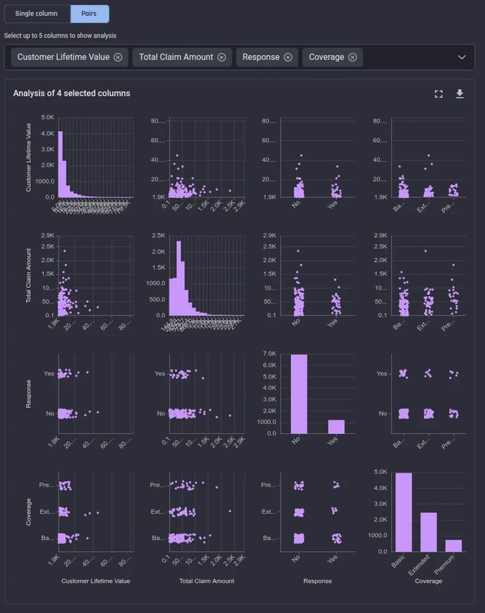
The pairs view is quite useful in inferring relationships and correlations between two chosen columns.
Types of analysis results
There are two types of analysis results possible on the Engine: The overall distribution (no grouping) and additional analysis (with grouping).
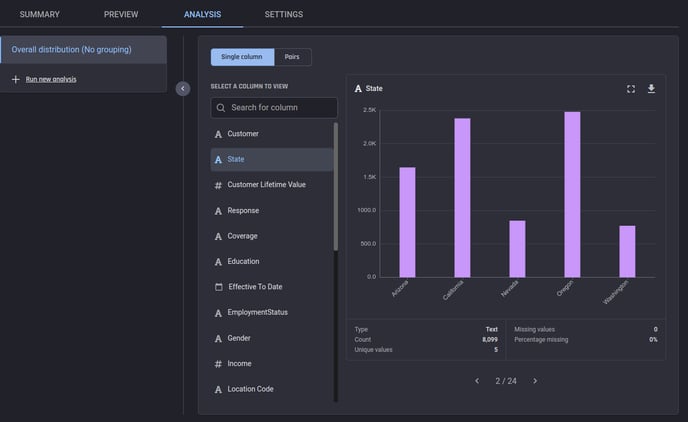
Overall distribution (no grouping)
This is the result of the default analysis that runs automatically upon creation of the dataset. The single-column view shows the overall distribution of values in the chosen column.
Additional analysis (with grouping)
While performing data analysis for exploratory needs, you would often want to know how the distribution of a particular column varies between different groups defined by another column. This is commonly known as “grouped by” or “slice-and-dice” analysis.
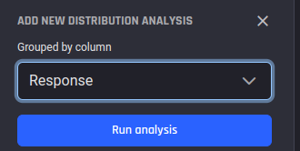
You can obtain such analysis results on the whole dataset using the “Run new analysis” function. You will be asked to choose the column to group by:
|
|
|
|
| 1. Choose “Run new analysis” | 2. Set the column to group by and choose “Run” | 3. Choose “Run analysis” |
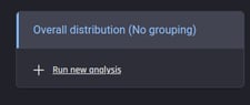
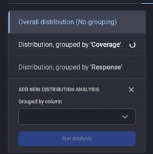
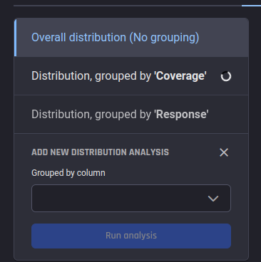
Analysis will be performed on demand upon choosing Run analysis. Your results will be available as additional items next to the “Overall distribution (No grouping)” result:
In the pairs view, the same scatter charts are shown as in the “overall” analysis, but the points are colored according to the group they belong to:
💡 Due to visualization limitations, we currently apply a maximum limit of 5 groups irrespective of the actual number of unique values in your grouping column. If there are more than 5 unique values, we choose the first 4 most frequent values and make 4 separate groups and combine the rest of the smaller groups into a single group labelled __other