This article explains the ROC and PR curves, which are common methods used to evaluate a model for binary classification.
Background
Most classification models learn to output a score for each distinct class from the values of the feature columns. The score often represents the prediction probability that a particular example belongs to the chosen class label.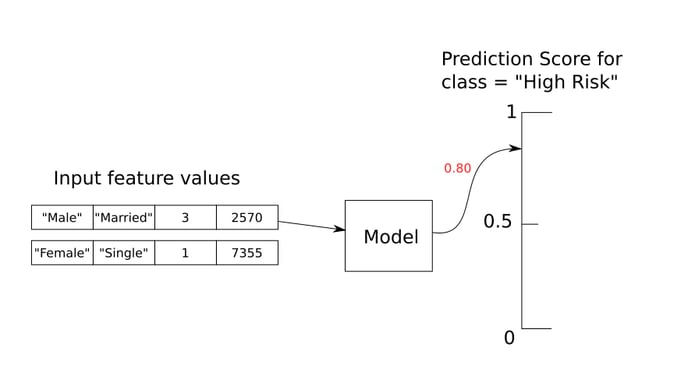
Example: a classification model predicts whether a patient is at high risk for a disease
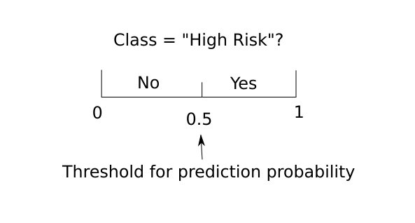
The predicted label results from comparing a decision threshold with the prediction score of the positive class. For example, a model predicts “High Risk“ (positive class) for a patient if the patient’s prediction score from the model is greater than the threshold 50%.
This article discusses how different decision thresholds can affect model performance. As a result, the ROC curve and PR curve are introduced to provide an overall view of how different trade-offs can be achieved by adjusting the decision threshold.
Influence of Decision Threshold on Model Prediction
The decision threshold can be chosen in a way that the model has less chance of missing an example that genuinely belongs to the positive class (in other words, low miss rate or high recall). It can also be selected by keeping the number of examples wrongly detected as the positive class below an acceptable level (in other words, low false detection rate or high precision). For the definitions of precision and recall, see this page. Consider the following three scenarios, given the symbols below:
.png?width=688&name=Description%20of%20AucRoc%20Curve%20-%20TDS%20(3).png)
-
When the decision threshold is too high, the model is too specific and thus fails to detect all positive examples (with label “+“). Even the chance of false detection is very low, there is a high miss rate or low recall.
.png?width=688&name=Description%20of%20AucRoc%20Curve%20-%20TDS%20(1).png)
High decision threshold can lead to high precision, low false positive rate, but low recall (true positive rate).
-
When the decision threshold is too low, the model is too overreaching – as a result, negative examples (with label “-“) are more likely to be classified as positive. In this case, the model has a low precision or high false detection rate.
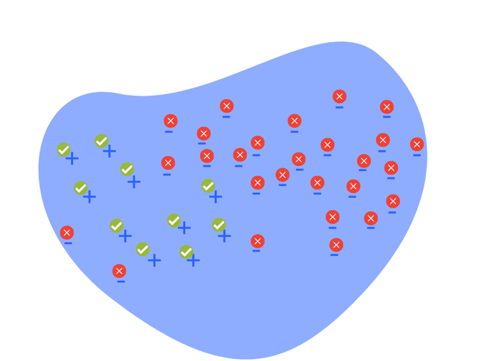
Low decision threshold can lead to high recall (true positive rate), but low precision or high false positive rate.
-
When the decision threshold is well selected, the model is at optimal performance – high precision, high recall (true positive rate) and low false positive rate.
.png?width=688&name=Description%20of%20AucRoc%20Curve%20-%20TDS%20(2).png)
Optimal decision threshold leads to high precision, high recall (true positive rate (TPR)) and low false positive rate (FPR).
ROC Curve
ROC Curve
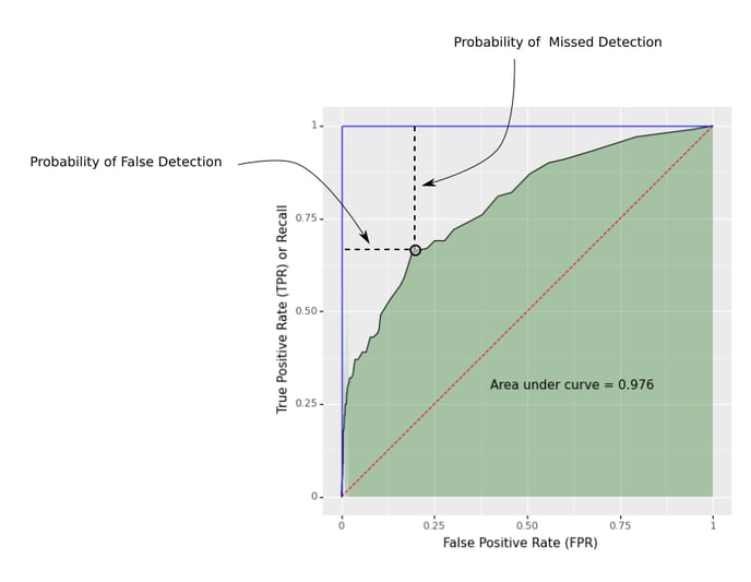
Plot of the true positive rate (also known as recall) on the vertical axis versus the false positive rate on the horizontal axis, evaluated at different decision thresholds
Here ROC is short for Receiver Operating Characteristic, originally developed for operators of military radar receivers in 1941. Below is an example:
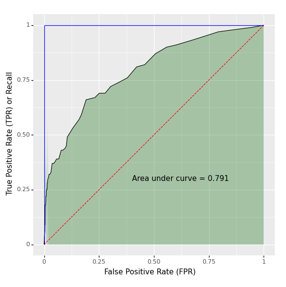 The Area under the Curve (AUC) is the area under the shaded region shown in the above figure. This is an important metric that can be used to summarize an ROC curve. It equals 1 for the ideal model, which is shown in the blue line, starting from the bottom left (0, 0) to the top left (0, 1) and remains flat up to the top right (1, 1).
The diagonal dashed line in red is the ROC curve for a baseline model with zero skill, which outputs a random guess of the score, without taking any input column into account. For such a model, the false positive rate and true positive rate are the same at each threshold. Here the AUC equals 0.5, which is the area of the triangle bounded by the horizontal axis, the diagonal line and the vertical line when the false positive rate equals 1.
Each point on the ROC curve corresponds to a certain value of the decision threshold. The bottom-left point on the curve has the highest threshold while the top-right point on the curve is associated with the lowest threshold. At each threshold, the probability of missed detection (proportion of positive examples identified as negative by the model) can be determined by the length of the vertical line drawn from the point to the top horizontal line bounding the curve; the probability of false detection (proportion of negative examples identified as positive by the model) corresponds to the value on the horizontal axis. The ideal case occurs when we can set the decision threshold, such that a point on the ROC curve is located at the top left corner -- both probabilities are 0.
PR Curve
Precision-Recall (PR) Curve
Plot of the precision on the vertical axis against the recall on the horizontal axis, at different decision thresholds.
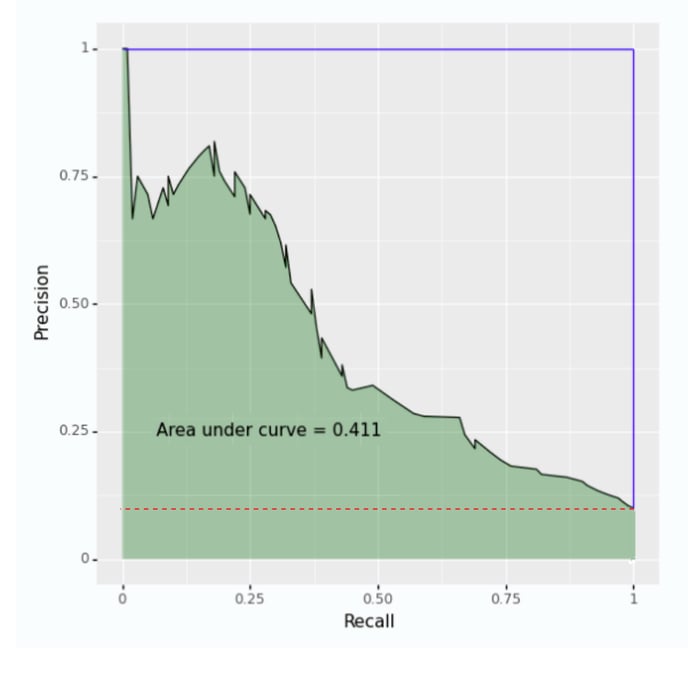
Similar to the ROC curve, each point on the PR curve corresponds to a decision threshold. The top-left point on the curve corresponds to the highest threshold and the bottom-right on the curve is associated with the lowest. The AUC of the PR curve is the shaded region in the above figure. The ideal model is shown in the blue line which passes the point when both precision and recall are 1. The baseline model with zero skill is indicated by the red horizontal line where the precision approximates to the proportion of positive examples over the whole dataset.
When the dataset has a very small proportion of positive examples, the PR curve is a better indicative of model performance. The ROC curve can be misleading as it is sensitive to changes of even a small number of correct or incorrect predictions. Examples of such use cases are: fraud detection and supervised anomaly detection.