This article explains the different metrics used to evaluate a binary classification model's performance and identifies the best metrics to do so.
Binary classification models classify each observation in a dataset into one of two categories. Once the classification task is completed, the results need to be evaluated to inspect its performance. Based on the characteristics of the dataset, the AI & Analytics Engine suggests the most suitable metric as “Prediction Quality”, for that purpose.
There are many other metrics and plots available in the AI & Analytics Engine to easily compare and evaluate the trained binary classification models. This article introduces the binary classification metrics and plots available in the Engine.
 Binary classification evaluation metrics in the AI & Analytics Engine
Binary classification metrics available in the Engine
Binary classification models typically produce a decision score (most models produce prediction probability as the decision score), and a threshold is used to calculate the predicted class based on this. As such, binary classification metrics can be categorized into two categories:
-
Metrics that depend on a threshold decision score, and
-
Metrics that are independent of a threshold.
These metrics require the positive class label to be specified. By default the minority class is chosen as the positive class in imbalanced datasets in the Engine as typically it is more important to identify this class accurately.
For example: in a medical diagnosis problem, the minority class will be the patients with the disease which is more critical to identify accurately than the healthy patients. However, the user has the option to change this according to their requirements if needed.
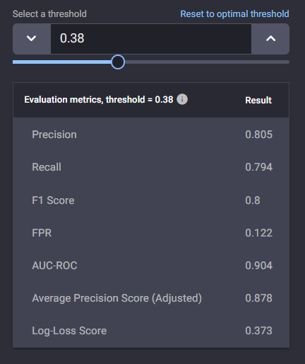
Threshold-dependent metrics
These are metrics that require a threshold, based on the decision score, to determine the predicted class label. For example the threshold of 0.5 is typically used when probability is used as the decision score to determine the predicted class label. These predicted class labels are then compared with the actual class labels to calculate the metrics.
Precision
This calculates the proportion of the observations, predicted by the model as positive, that are actual positives.
Recall
This calculates the proportion of the actual positive observations, that are predicted correctly by the model as positive.
F1 score
This takes into account both precision and recall metrics by calculating their Harmonic mean.
False-positive rate
This calculates the proportion of actual negative class observations that are incorrectly predicted by the model as positive.
For False-positive rate, the lower the value, the better the model. For all the other metrics, a higher value indicates better model performance. All these metrics have a range from 0 to 1.
In the Engine, the threshold to determine the predicted class to calculate these metrics is chosen such that the F1 Score is highest.
Threshold-independent metrics
These metrics try to capture the model’s performance across all possible decision score thresholds. Hence, these metric values are independent of a particular threshold. There are three of such metrics available in the Engine:
Area Under the Receiver Operating Characteristic Curve (AUC ROC)
The ROC curve is a plot of the True positive rate (similar to recall) against the False positive rate. This AUC ROC metric measures the area under this curve.
💡AUC ROC is the best measure to use in the case where the positive class is not a minority. Hence, it is used as a proxy for Prediction Quality in the Model Leaderboard page.
Average Precision score (adjusted)
The PR curve is a plot of the precision as function of the recall.
Similar to AUC ROC, the AUC PR is the area under the PR curve. This would be the metric of choice, however, this is not used in the Engine because, in some situations, for high enough threshold values, the precision might not be defined1 and there is no “area” beneath undefined precision values.
Hence, to allow for comparison of area under the curve between models that have a full curve and those that do not, the Average Precision score (adjusted) is defined.
It is the scaled area under the PR curve, which is the area under all the defined points of the PR curve times a scaling factor that corrects for the “missing area” beneath the undefined points, if any.
If the curve is fully defined, the AP (adjusted) is identical to the AUC PR.
💡 Average Precision score (adjusted) is the best measure to use in the case where the positive class is the minority. Hence it is used as a proxy for Prediction Quality in the Model Leaderboard page.
🎓1Precision is defined as True Postive count (TP) / (True Postive count (TP)+ False Postive count (FP)). For a high enough threshold, there may not be any true positive (TP = 0), but also, since the threshold is too high, there may not be any false positives as well (FP = 0). This leads to a Precision = 0 / 0 which is not defined.
Log loss
This metric calculates the negative of the average logarithm value of the actual class’ predicted probabilities.
A higher value in AUC ROC and Average Precision score (adjusted) indicates a better model, while a lower log loss value corresponds to a better model. AUC ROC and Average Precision score (adjusted) can have a value range from 0 -1, while log-loss values can be anywhere from 0 to infinity.
Selecting the most suitable binary classification metrics
Selecting the correct metric for a particular binary classification task is crucial. The correct metric typically depends on factors such as the problem the user is trying to solve, and the distribution of class labels.
For example, when the positive class of the binary classification task is the minority, the Adjusted Average Precision Score is considered a good metric. Medical diagnosis and fraud detection can be practical examples of such scenarios. On the other hand, if the positive class is not the minority, AUC ROC is preferred.
Recall and precision by themselves may not be good choices. A model can achieve the highest recall of 1.0 by always outputting the positive class without looking at the input. With precision, the model can output the negative label if the input does not lie in a very narrow range where it is 100% sure. The F1 score takes into account both precision and recall.
Threshold-dependent metrics depend on a chosen decision score threshold, and are only relevant for that particular threshold. Therefore, if the threshold were to be changed, the metric value will change as well. On the other hand, threshold-independent metrics are measures of the model’s performance regardless of a threshold. These metrics evaluate how well the model “separated” the two classes during predictions. As such, they can be better indicators of a model’s performance in the majority of the binary classification tasks as compared to threshold-dependent metrics.
The AI & Analytics engine suggests the most suitable metric for each binary classification task based on the characteristics of the dataset. The most suitable metric is shown as the “Prediction Quality” in the “Model Leaderboard” page of the supervised ML models.
Plots
There are three useful plots in the Engine to consider when evaluating binary classification model performance.
Confusion matrix
The confusion matrix shows the number of observations belong to each class in actual data and predictions. Rows in the matrix correspond to subsets of test-set instances with the same true (“Actual”) label, indicated in the row header. Each cell within the row shows the number of instances within that subset where the model predicted the label indicated on top of the column.
The intensity of the fill color in each cell corresponds to the fraction of the subset for which the model predicted the label shown on top of the column. The diagonal cells in the matrix show the number of instances that are correctly identified. Hence, a higher color intensity in those cells typically indicates a better model. The threshold for the confusion matrix is chosen such that the F1 Score is highest.
In the example shown below:
-
The first row shows there were 83+4 = 87 instances in the test set where the actual label was 0.
-
For 83 of the 87 instances, the model correctly predicted 0.
-
For 4 of the 87 instances, the model incorrectly predicted 1.
-
-
The second row shows there were 16+95 = 111 instances in the test set where the actual label was 1.
-
For 16 of the 111 instances, the model incorrectly predicted 0.
-
For 95 of the 111 instances, the model correctly predicted 1.
-
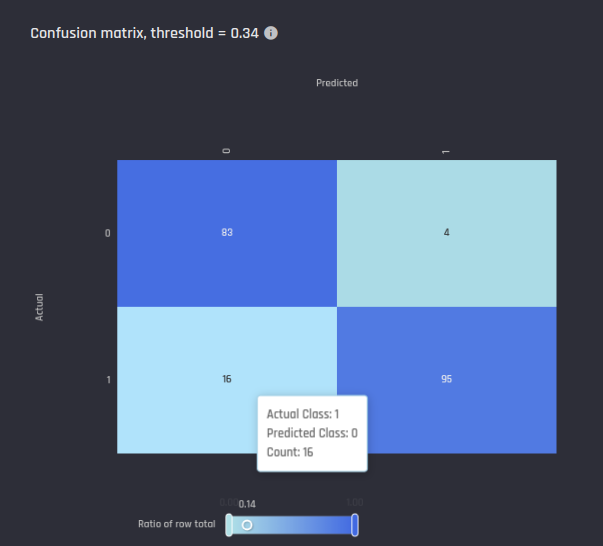 Example confusion matrix in the Engine
ROC Curve
A plot of the True positive rate (similar to recall) against the False positive rate for all thresholds. The diagonal line in the ROC curve characterises a baseline where the prediction for each observation is just chosen randomly. Higher the area under the ROC curve the better the model performance.
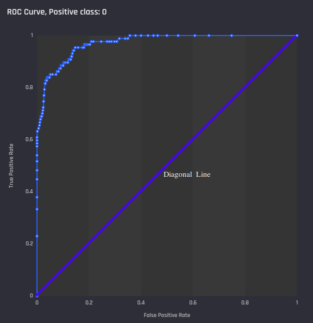 Example ROC curve in the Engine with diagonal line added
Precision-recall curve
A plot of the precision against recall for all thresholds. Similar to ROC curve, higher area under the curve shows a better model.
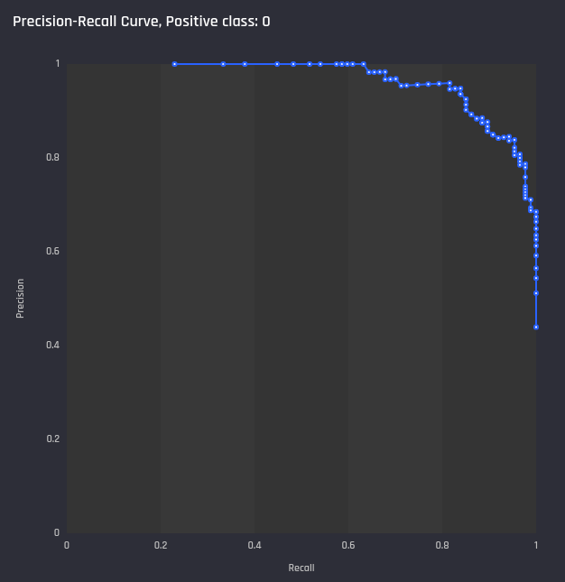 Example Precision-Recall curve in the Engine
🎓 For more details on how these curves, read what are ROC and PR Curves for binary classification.