Insights are automatically generated by the Engine once a clustering algorithm finishes running. In this article, learn about these insights and how to interpret them.
Clustering is a set of machine-learning techniques that automatically discover groups of similar items from a large dataset. Output offered by software tools and libraries for clustering typically only includes the cluster ID assigned to each item in the input. From this result, one can easily derive:
-
The number of clusters produced,
-
The sizes of each cluster, and
-
The number of outliers (that have not been assigned to any cluster).
However, these basic insights provided by standard tools are insufficient to obtain a deeper understanding of clusters needed to make better business decisions.
Instead, it would be necessary to answer the following deeper questions:
-
Is the quality of the clustering result good?
-
What are the important features or attributes that distinguish a cluster from the rest?
-
Are the clusters explainable, i.e. can the clusters be described in a meaningful way?
The AI & Analytics Engine provides answers to these questions readily in the form of insights under clustering result page. These insights are automatically generated by the Engine once a clustering algorithm finishes running. In this article, we introduce these insights and show how to interpret them, by walking through a few sample results generated by the Engine.
🎓To generate clustering results, you first need to build your clustering pipeline learn more by reading: How to build a clustering pipeline with the Engine.
Clustering quality
Before making any informed decision, you need to evaluate the clustering result properly. The quality of the outcome can depend on the objective of the analysis under a specific context, but in general, a good clustering approach should lead to well-separated clusters.
In this case, the items within a cluster are similar while those from different clusters are distinguishable from each other. On the Engine, the quality of the clustering result can be understood by the 2D visualization of the dataset generated by the UMAP dimensionality reduction technique. A good output does not typically involve overlapped items, while overlaps between clusters reduce the clustering quality.
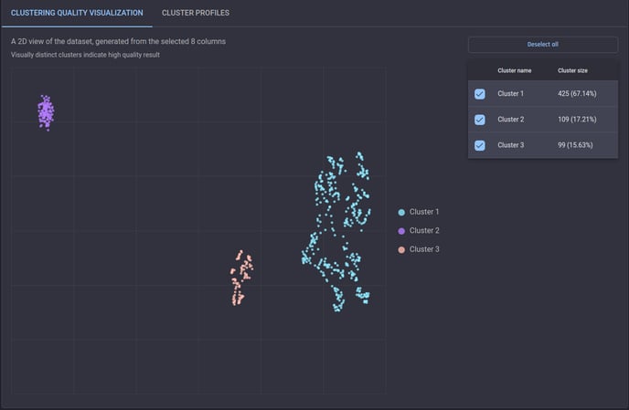 Example of a high-quality clustering result
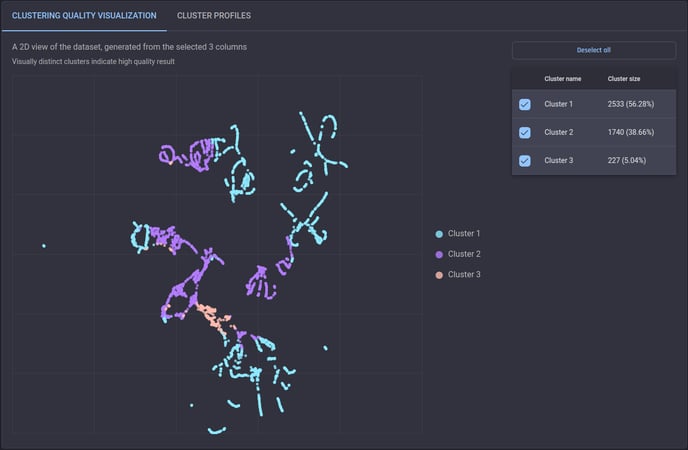 Example of a clustering result that is lower in quality
Cluster Profiles
While the 2D clustering quality visualization gives a view of clusters with patterns that may not be apparent in the original dimensional space, we need to check how clusters can differ across features, especially for those we are particularly interested in.
On the Engine, cluster profiles are provided to assist in interpreting the overall effect of the top 10 most important features on the clustering result. As seen in the screenshot below, a heat map is shown with a value for each pair of clusters and selected features, indicating the difference (in percentage) between the average value in the cluster and the average over the whole dataset. By comparing different values across clusters for each feature, you can better understand how each cluster can be characterized by these features.
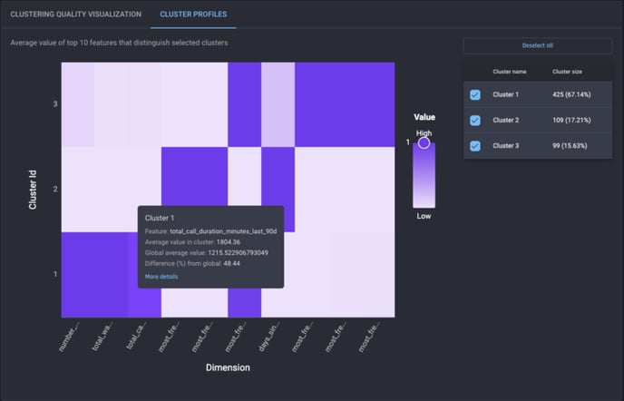 Example of a heat map of the clustering result
Detailed description of clusters
Apart from cluster profiles, you can further explore how each cluster is identified from the dataset for a comprehensive understanding of the result. However, it is often complex and less intuitive to follow the flow of a clustering algorithm.
Alternatively, the Engine provides a simple description of how the items in a cluster can be filtered out by one or more sequences of conditions based on feature values. For example (as seen in the screenshot below), two filtering conditions are used to find Cluster 3:
-
if the first condition that the feature most_frequent_call_outcome_last_90d is either “problem resolved“ or “information provided“ is applied to the whole dataset (with 99 items in Cluster 3 and 534 for the rest), all the 99 items in Cluster 3 remain with only 4 items from other clusters or outliers;
-
if the remainder of the above step is filtered by the second condition that number_of_service_requests_last_90d is less than 6, only the 99 items in Cluster 3 are left.
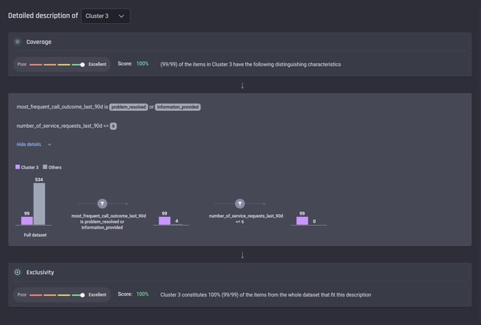 Example of a detailed clustering description
The description mentioned above includes a single sequence of filtering conditions. In practice, there can be more than one sequence of conditions for a cluster – in this case, the items filtered by all sequences, also called subdivisions, are considered for this cluster (see below for an example).
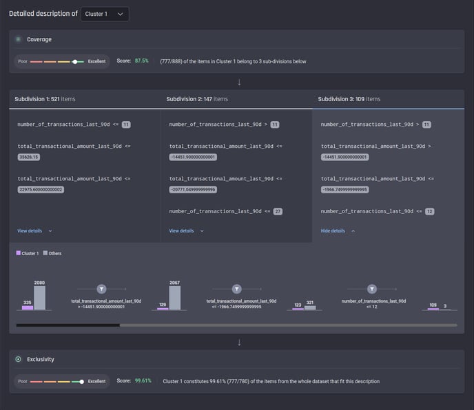 Example of a clustering description with 3 subdivisions
As you may realize, the detailed description is generated based on a decision tree classifier trained with the clustering result. Here two metrics are given to measure how well the description fits the clustering result:
-
coverage – the percentage of all items in the target cluster that are identified by the description. For example, as seen in the above screenshot, there are 888 items assigned to Cluster 1, while only 777 items (521 from Subdivision 1, 147 from Subdivision 2 and 109 from Subdivision 3) match the generated description – then the coverage is 87.5% (777/888)
-
exclusivity – the percentage of all items (from either the target cluster or other clusters) that match the generated description that actually belong to the target cluster. In the above example, the description identifies 780 items (521 from Subdivision 1, 147 from Subdivision 2 and 112 from Subdivision 3) from the whole dataset. Among these items, 777 are from Cluster 1, so the exclusivity is 99.61% (777/780)
Conclusion
In this article, you can see how to understand the outcome of the clustering process on the Engine. With a dimensionality reduction, the quality of the clustering result can be evaluated by a 2D visualization. You can also check the effect of different features by cluster profiles. Finally, you gain deeper insights into how the items in each cluster can be identified from the dataset by a fine-grained description. At different levels, the Engine makes it easier for you to decide whether the clustering result is ready to be applied in further analysis.