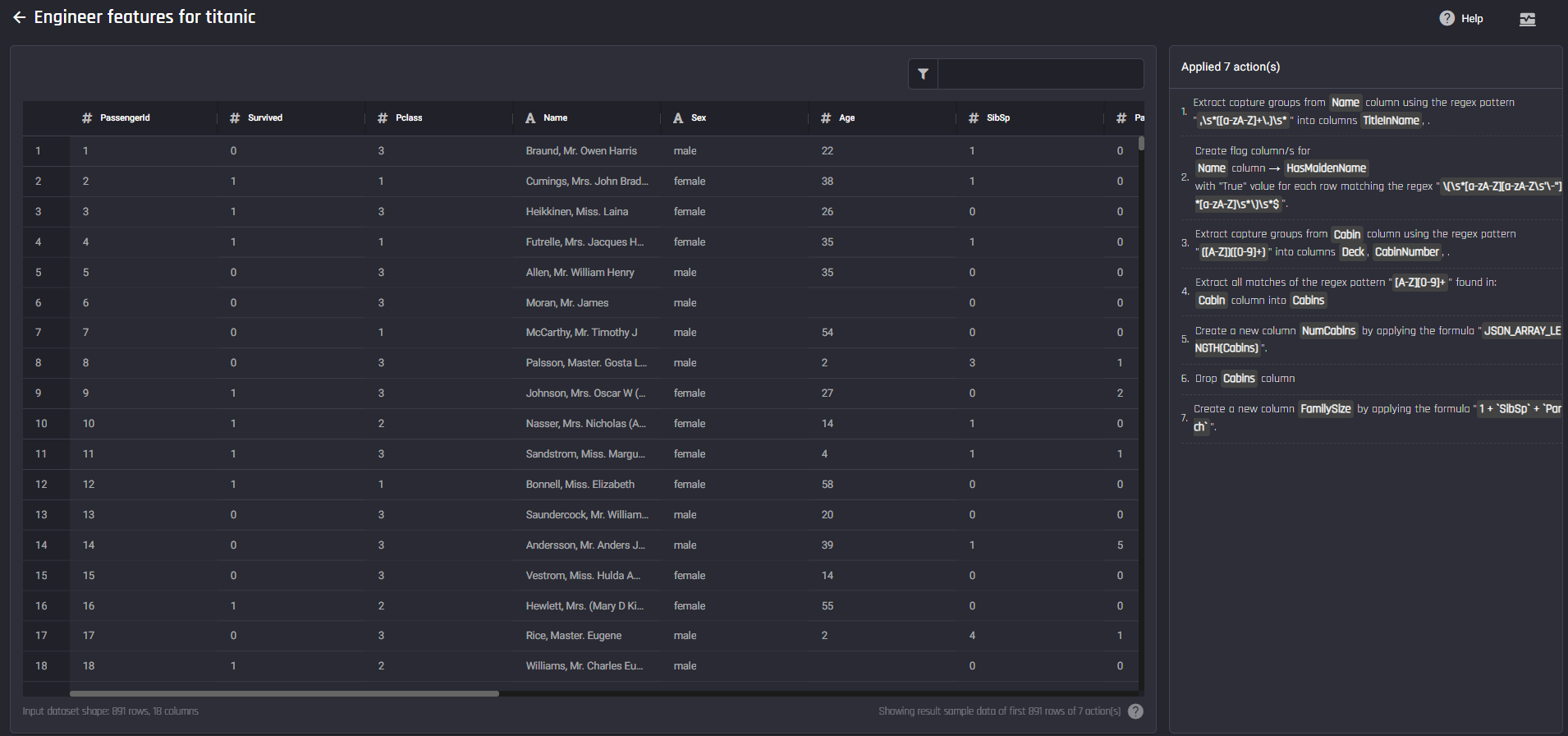
 Data wrangling receipe with 7 actions
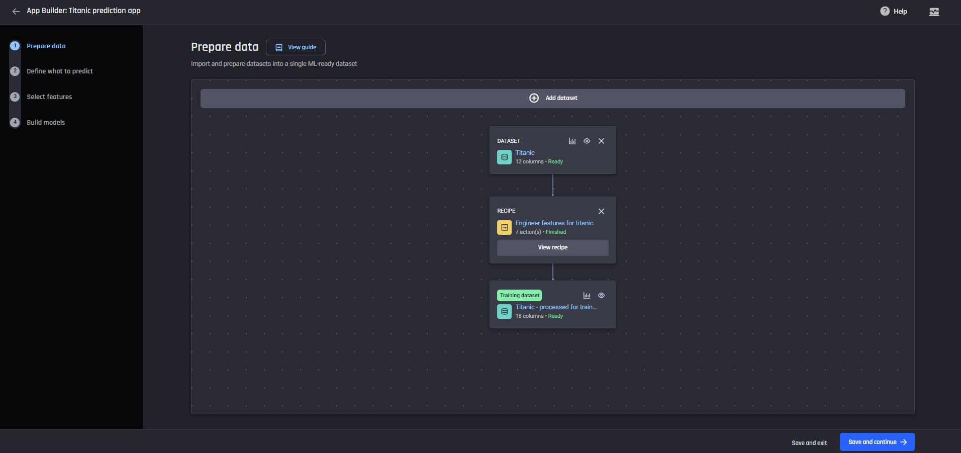 The data preparation pipeline
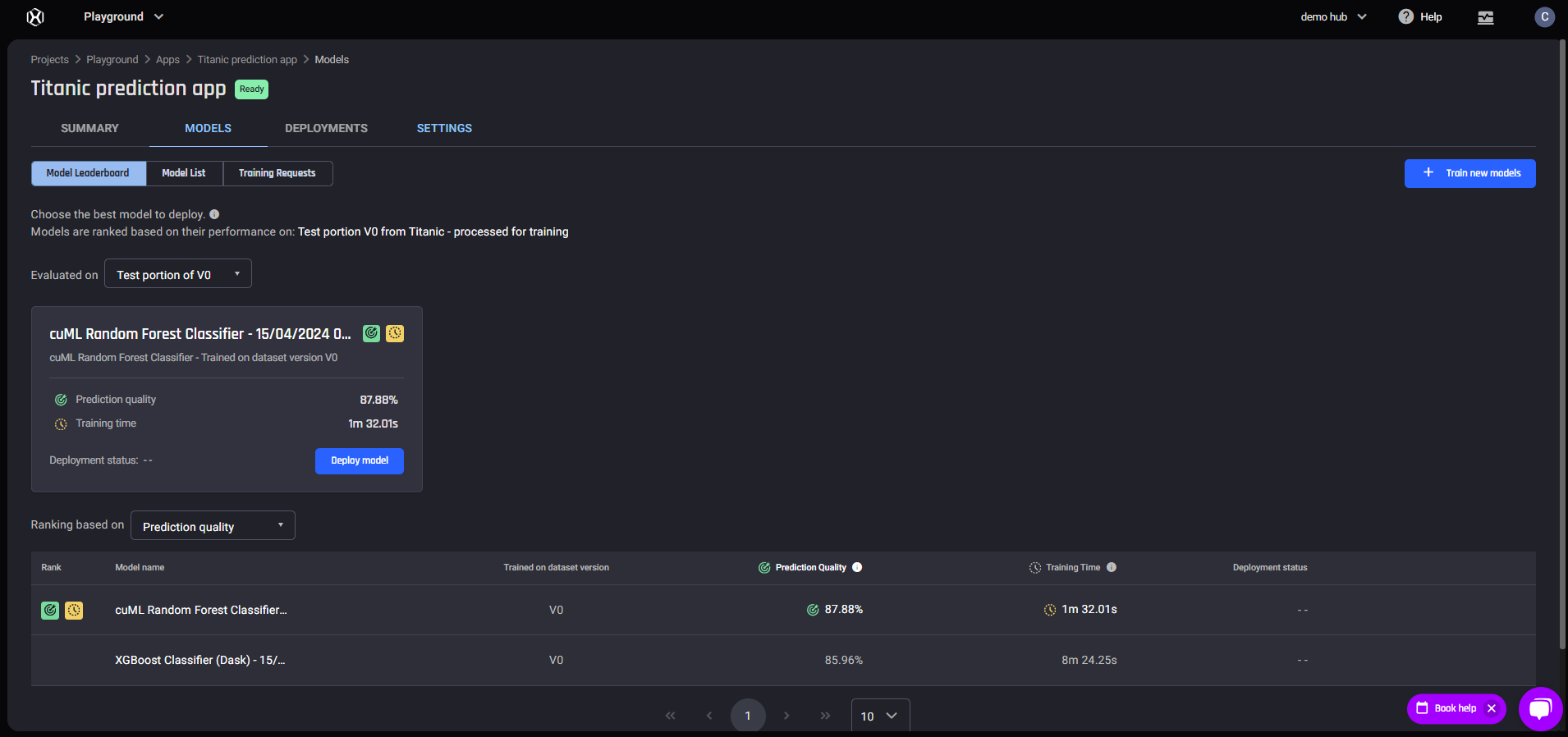 Model Leaderboard page
 Performance tab
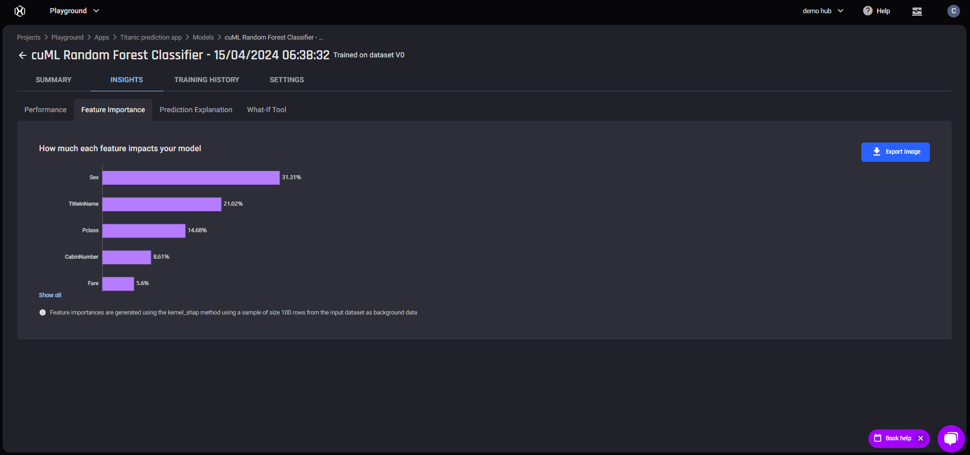 Feature Importance tab
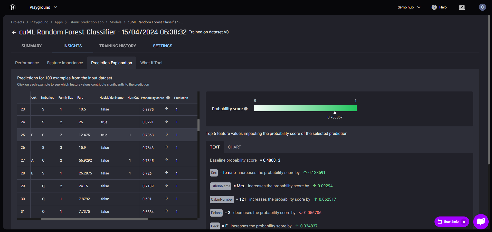 Prediction Explanation tab
Model Performance
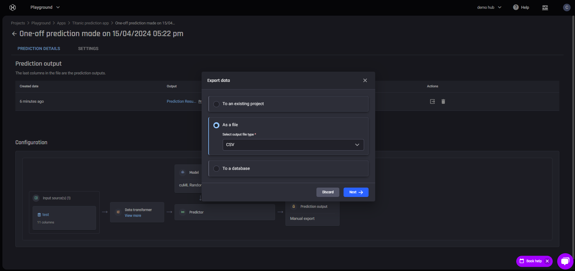
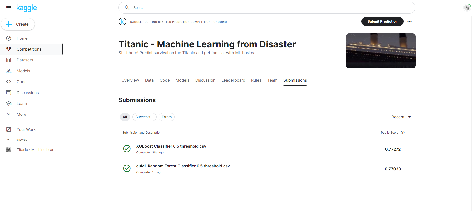
Testing models: Analyzing Batch prediction results using Excel
Analyzing prediction results is critical in evaluating the performance of trained models. We demonstrate how you can use Excel to evaluate your model